Userscapecom V2 Complete
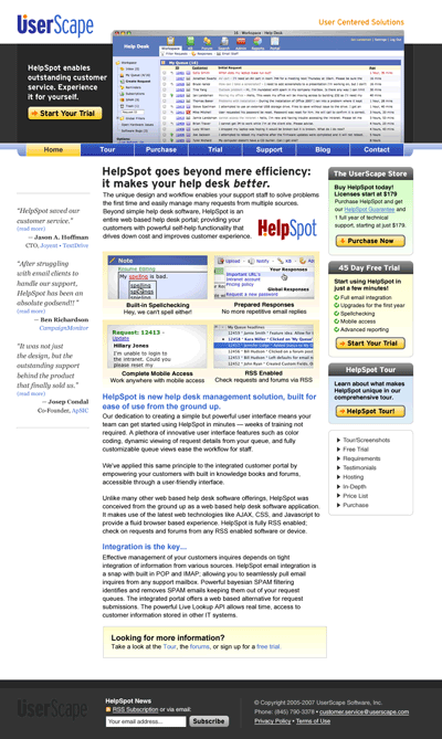
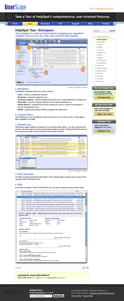
A few months backed I posted on the initial sketches of the next version of the UserScape.com website. I'm happy to say that the process is now complete and we're moving forward with HTMLizing the design and should be implementing it in the next few weeks. I'm really happy with the job MIke did as always. I think this is his best work yet. The design is modern and I really like the use of black which plays nicely with the colors. The final designs are below (note that not all text is accurate). Also the top and bottom black bars extend the full width of the screen which is not really shown in these graphics.
The big differences between this and the current site are much clearer calls to action (especially the home page which is right in the banner), a more designed interface with rounded edges, a clearer navigation scheme with primary top navigation and secondary side navigation, and the large homepage screenshot which should help leverage HelpSpots nicer appearance compared to the competition.
Homepage
Inner Pages

