Creating A Business Logo
So you want to be in business? You need a logo! This article documents the process I went through to create the logo's for UserScape (the company) and HelpSpot (our new help desk software). Hopefully this can provide some guidance for future ISV's on how the process goes.
The first step was contacting Mike Rohde of MakaluMedia. I found him via the NSLog weblog, which was having a design contest that Mike won. While everyone may not be able to get this lucky and find a great designer by accident, I do encourage you to look through the weblog world for one. Many many designers have blogs and it's a great way to see what a designer is about. Usually they'll have samples on their site, but more important is that you can go back through their blog and get a feel for how they work, their style and so on all without a lot of phone calls, emails and general back and forth.
Once I contacted Mike we went over my business plans, what sites I admire and the general feel I was looking for. Mainly I was looking for something modern, but I explicitly did not go into any great details. I prefer to let the designer come up with a variety of options first with only rough guidance. I find this usually works the best as they'll often take the design in a direction you haven't thought of. Remember you're no designer! Let them go and be free to create beautiful images, your job is to rope them in when they go too far and keep the process moving in the right direction.
Mike is the first designer I worked with who does all his conceptual drawings on actual paper (fancy that). Below are the first sketches he sent. As you can see there are a bunch of ideas on here. This is why I love letting the designer do their thing first. This is so much more productive as a first pass than if he went off and came back with 2 options because I specified everything down to the inch.
Some of the ideas here include "text as logo", a helping hand, a group of users, small group of users, and some abstract users/symbols based on an @ sign.


After some discussion we focused in on trying the "text as logo" based approach using dots to represent different features in each one. In the UserScape logo it represents a user and with the HelpSpot H it forms an exclamation point. The dot worked nice because it carried through from company logo to product logo.
Mike then went to work doing a more detailed version as well as taking one more pass at the "helping hand" theme. In the end I thought the hand was just a bit creepy and I preferred the connected feel between the UserScape and HelpSpot logos that the dot provided.

Now that the dot's were agreed upon it was time to build them in a digital format and decide on fonts. Mike has a rule about not talking about color until the end and I think it's a great rule. I know whenever I've built websites for people in the past that they always get caught up on color. It doesn't matter how much functionality is there all they want to know is if mauve would look better than magenta. Leaving the color out definitely helps keep you focused on the structural design decisions.
Here we have the initial go at it and #4 (lower right) is actually very close to the final product. It's Interstate Condensed Bold (for start of word) and Regular (for back half). Interestingly Interstate is a font that was developed for the interstate highway system. It's what you're looking at on all those big green signs.

Things were looking good, but I wanted to checkout Futura a bit more. We also decided to change the cut style on HelpSpot from rounded above the dot to flat above it. Here you can see the one we went with (lower left).

With the tough stuff over it was time to finally get down to colors. Here's the first stab at it. We tried a few different ideas here. Different colors for first word and second word, same color, same color with different first letter. They were good but nothing really stood out to me. #5 down was probably my favorite, but it was a bit too "Mets" for me, though it made me sure I wanted the dot to have a color which stood out from the rest.

For the second round a few new color combinations were added. I really liked #5 and it almost won out.

Here's the final layout. It was a very close call between #1 and #2. In the end, the way the orange dot contrasts with the darker colors works a bit better. Also Mike's wife and my wife preferred the second one so that's what we went with :-)
Here are the final versions:
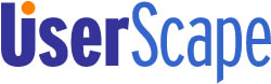

I'm extremely pleased with how they came out. They look good on the web and will also perform well on business cards, print brochures and so on. Their simplicity makes them very easy to recognize and the strong colors attract the eye.
Hopefully some of you have found this pictorial interesting and informative. I encourage everyone to leave design to designers. This work is not that expensive and having it done professionally makes all the difference. You don't know Photoshop as well as you think you do! Using Visibone to pick your colors isn't going to cut it. Get it done right the first time so it doesn't need to be done again later.
Check back soon for my next article, which will document the process Mike and me are going through now to design the page template for the UserScape website.